


The Challenge
At RallyPoint, the majority of our traffic came to our site via social channels. Although we had many repeat visitors, we witnessed a common pattern of users consuming a single piece of content and then leaving. We had a massive amount of unique visitors hitting our show pages each month but our registration conversion was below 1%.
We knew there had to be a correlation between this behavior and the low conversion rate. This was a real opportunity to improve our core product and make the marketing team's lives significantly easier if we did it right.
The Research

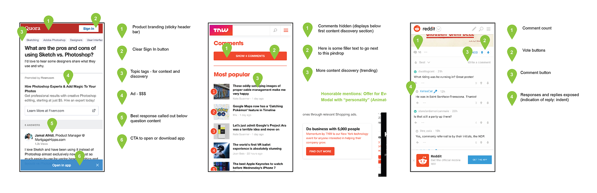
Based on our current analytics coupled with our historical data regarding use patterns, our assumption was that the problem wasn’t so much usability as it was how to create a better discovery flow for visitors. The first thing we did was take a look at what users were currently seeing and conduct a heuristic evaluation. Because most of this traffic was coming through Facebook, we saw potential to optimize in two core scenarios:

Mobile web users (general)
- No true content discovery
- Only possible ways to navigate to any other pages were hidden
- The only clear CTAs were to Log In or Sign Up
- Confusing navigation patterns
Native Facebook users (additional to mobile web issues)
- Users hitting “back” on Facebook wrapper and being sent directly back into their FB experience
- Very similar color schemes and page layouts (FB wrapper)
- Visitors would comment on the FB post but would not comment within RallyPoint itself
From this data we came up with two hypotheses for the updated designs:
- Users need easier ways to explore more content (exposing the value of RallyPoint)
- We need to create paths to get users out of "Facebook browsing"
We then looked at the competitive landscape for some inspiration and insight into how they were handling similar experiences.
The Execution
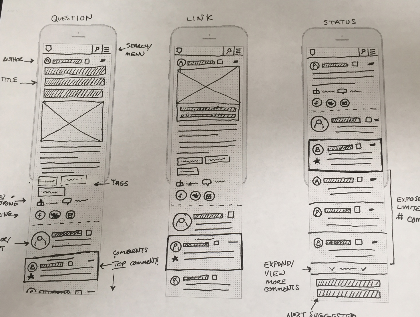
For the main body content we remained consistent with what currently existed but worked on improving the visual design and layout. For the new features, the overarching theme was to build a modular layout that we could easily swap in different sections and split test without things getting too murky. The final product was broken into three variations to test initially, a control, a discovery option, and a version with an email newsletter sign up.
The Designs

Check out the live product at rallypoint.com